Part 1: Image Histograms
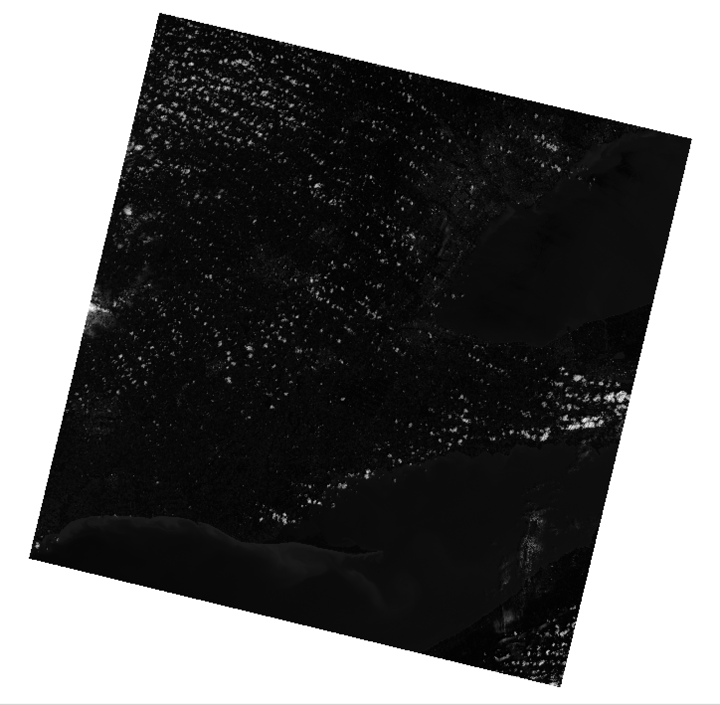
Using your visiualization software of choice (e.g. Whitebox GAT, QGIS, ArcGIS), display the Band1.tif image, contained in the decompressed Lab 2 data folder which you should have downloaded from the CourseLink site. You should find the the image looks something like the following:

This scene contains extensive cloud cover. The clouds are so bright in this image that every other landcover appears to be extremely dark, nearly black, by comparison. Therefore, the presence of clouds is significantly degrading our ability to descern the relatively small contrast (differences in brightness) between other types of land covers. Using the RasterHistogram, and the WhiteboxTools Runner application, calculate the frequency distribution graph (histogram) for the band1.tif image.
Include a screenshot of the Band 1 image histogram with your Lab hand-in. (1 mark)
Notice that the frequency distribution of values contained in the band1 image is heavily skewed, with a long tail of values to the right of the distribution peak. This tail is associated with the cloud cover. Most of the non-cloud pixels in the image occupy the two peaked bins associated with the lowest DN values. The greytone values of the image display palette are being spread across the entire range of DNs contained within the image. However, most of the variation in DNs that we are interested in, that is, the range of DNs within the non-cloud portions of image, are only displayed with a very narrow range of darker tones as a result. This is the reason for the poor contrast in the displayed image.
1.1. What are the minimum and maximum DNs within the
band1image? Hint you may use either your visualization software or the RasterSummaryStats tool to determine these values. The GeoTIFF file in which these data are contained has a 16-bit radiometric resolution. Do the image data completely occupy the bit-depth of the file? (3 marks)
Now display the band5.tif image and use the RasterHistogram tool to create this image's frequency distribution.
Include a screenshot of the Band 5 image histogram with your Lab hand-in. (1 mark)
1.2. How would you describe the overall contrast characteristics of the
band5image compared withband1? Which is easier to distinguish individual agricultural fields in? What is the peak in the frequency distribution of theband5histogram associated with? (4 marks)